ClappIt
Designing an enterprise cloud infrastructure platform that simplifies deployment visibility and operational workflows for modern DevOps teams.
Figma · Miro · FigJam · Notion
UX Designer (me) · 2 DevOps Engineers · Product Lead · 3 Frontend Engineers · Founders
UX Research · Wireframes · Hi-Fi UI · Design System · Prototypes · Developer Handoff
The Experience Was Broken
DevOps engineers are powerful users — but the existing interface was working against them at every turn.
Dense, unstructured dashboards dumped raw data without hierarchy. Critical alerts competed with secondary metrics for equal visual weight. New team members faced a brutal onboarding cliff. Stakeholders with less technical depth were completely lost — yet they had to use the same production dashboards engineers relied on daily.
Cognitive Overload
Critical alerts, deployment statuses, pod health, and network metrics competed for attention equally. Engineers had to manually sort what mattered from what didn't — every single session.
Fragmented Cloud Views
Multi-cloud environments (AWS, GCP, Azure) were managed through separate, disconnected screens. Switching clusters meant losing workflow context entirely, forcing engineers to restart their mental model.
Opaque Deployment Tracking
Deployment states were labeled with technical codes only senior engineers understood. Rollbacks required 3–4 navigation steps with no visual confirmation of success or failure state.
Inconsistent Navigation
The sidebar mixed infrastructure primitives with operational actions in a flat, unlabeled list. Users couldn't predict where to find things — leading to repeated trial-and-error navigation.
Onboarding Cliff
New users encountered a fully-loaded production dashboard with no guidance, no empty states, and no contextual help. High drop-off within the first session was the result.
No Visual Hierarchy
Typography, spacing, and color were applied inconsistently. Critical status indicators used the same visual weight as secondary metadata — destroying scanability at a glance.
Who We Designed For
Five distinct user types — each with unique goals, frustrations, and workflow expectations that shaped every design decision.
DevOps Engineers
Frequency: DailyFast operational decision-making with minimal cognitive friction
Alert fatigue, opaque deployment states, context-loss when switching clusters
- One-click rollback
- Cluster-level resource overview
- Alert severity routing
Power users who prefer data density but are blocked by poor visual hierarchy
Cloud Infrastructure Teams
Frequency: DailyUnified visibility across multi-cloud environments
Switching between AWS, GCP, Azure UIs to get a unified picture is exhausting
- Single pane of glass
- Cross-cloud resource comparison
- Cost attribution per environment
Heavy keyboard users; need fast drill-down from cluster to pod level
Engineering Managers
Frequency: WeeklyHigh-level health summaries without needing technical depth
No stakeholder-friendly view — forced to use production dashboards or ask engineers
- Deployment success rates
- Team-level activity summaries
- Cost visibility
Non-technical; interpret visual signals only — never raw data tables
Platform Administrators
Frequency: WeeklyAccess management and governance with full audit visibility
No audit trail, no activity history, no way to track who changed what
- Role-based access control
- Audit trails
- Environment isolation controls
Compliance-focused; document every action — needs receipts for every change
Enterprise Operations Teams
Frequency: As neededBusiness continuity, SLA adherence, and incident reporting
No incident timeline or business-impact translation layer in existing UIs
- Incident dashboards
- SLA tracking
- Exportable reports
Occasional but high-stakes users; operate under pressure during incidents
The UX Workflow
An 8-stage process that moved from research to validated, high-fidelity delivery over 8 months.
Research
User interviews · Contextual sessions · Competitive audit
Discovery
Synthesis · Journey maps · Insight clustering
Wireframing
Lo-fi screens · Layout logic · 40+ wireframes
UX Flows
6 core flows · IA restructuring · Navigation redesign
UI Design
Visual language · Dark mode · Component design
Prototyping
Interactive flows · Interaction states · Figma prototypes
Testing
3 rounds · 16 participants · Task completion scoring
Iteration
Edge states · Error handling · Handoff documentation
Research & Discovery
- 16 structured user interviews
- 8 contextual observation sessions
- Competitive analysis across 5 platforms
- Stakeholder alignment workshops
Synthesized research report · Empathy maps · 4 validated personas
Identified alert fatigue and rollback anxiety as the two highest-friction pain points — both became north-star problems for the entire design phase.
Wireframing & UX Flows
- FigJam workflow mapping with engineering team
- 40+ lo-fi wireframes across all 8 modules
- 3 rounds of user validation
- Navigation restructuring into semantic zones
Complete wireframe library · 6 validated user flows · Navigation architecture
During round 2 validation, discovered engineers ignored the left sidebar entirely — cluster switching moved to persistent top-nav, dramatically improving confidence scores.
UI Design & Prototyping
- Visual language definition
- 120+ component design system
- Full dark/light mode implementation
- Interactive Figma prototype for every core flow
Hi-fi screen library · Interactive prototypes · Design token documentation
Chose light mode as the primary dashboard aesthetic — creating a more accessible, professional SaaS feel that differentiated ClappIt from all competitor dark-only UIs.
Testing & Iteration
- 3 rounds of moderated usability testing
- Unmoderated task-completion sessions
- Edge state and error flow validation
- Developer handoff with annotation layers
Usability test reports · Annotated spec files · Iteration log · Handoff documentation
Post-test iteration round focused entirely on empty states and error handling — areas consistently skipped in enterprise UX that cause the most real-world drop-off.
What We Were Solving For
Seven UX goals established in collaboration with stakeholders, each directly traceable to a user pain point from research.
Reduce Cognitive Overload
Surface only what's critical. Organise everything else by depth — not by dumping it all on screen.
Improve Deployment Visibility
Make deployment state readable in under 3 seconds — for both engineers and non-technical stakeholders.
Simplify Navigation
Restructure the sidebar into semantic zones so users can orient themselves without reading every item.
Increase Workflow Efficiency
The most frequent actions must be no more than one click away from their context in any module.
Improve Onboarding
First-session success for new users through contextual guidance, empty states, and progressive disclosure.
Scalable Enterprise UX
Design for 10 clusters, 100 services, and 1,000 alerts from day one — not retrofitted after the fact.
Enhance Operational Transparency
Every action must produce a visible, confirmable state change. No silent operations. No ambiguous codes.
"An engineer should understand the complete operational state of their infrastructure within 5 secondsof opening the dashboard — without clicking, scrolling, or decoding."
Where the Market Falls Short
Benchmarking 5 direct and adjacent competitors to identify gaps and position ClappIt's UX opportunity.
| UX Dimension | GitLab CI/CD | K8s Dashboard | Datadog | Harness | AWS Console | ClappIt |
|---|---|---|---|---|---|---|
| Dashboard clarity | ⚠️ Moderate | ❌ Raw data | ✅ Good | ⚠️ Moderate | ❌ Fragmented | ✅ Status-first |
| Non-technical users | ❌ None | ❌ None | ⚠️ Partial | ⚠️ Partial | ❌ None | ✅ Role views |
| Alert prioritization | ⚠️ Basic | ❌ All equal | ✅ Severity | ⚠️ Tags only | ❌ None | ✅ Smart groups |
| Rollback confidence | ⚠️ Basic | ❌ Code only | ✅ Yes | ⚠️ Partial | ❌ No | ✅ Visual flow |
| Multi-cloud unification | ❌ Single | ❌ Single | ✅ Yes | ✅ Yes | ❌ AWS only | ✅ Unified |
| Onboarding guidance | ⚠️ Docs only | ❌ None | ⚠️ Partial | ⚠️ Docs only | ❌ None | ✅ Contextual |
| Learning curve | 🔴 High | 🔴 High | 🟡 Medium | 🟡 Medium | 🔴 High | 🟢 Low |
| Design system consistency | ✅ Good | ❌ None | ✅ Good | ⚠️ Moderate | ⚠️ Partial | ✅ Systematic |
Alert UX Gap
Every competitor treats all alerts equally. Severity-first grouping was an untapped differentiator — and the single highest-impact usability improvement we could make.
Stakeholder View Gap
Zero competitors had a view designed for non-technical stakeholders. Engineering managers and founders were being forced into production dashboards.
Rollback Confidence Gap
No platform provided visual rollback confirmation — leaving engineers anxious about production state changes. This was our biggest enterprise trust opportunity.
How I Approached It
A systems-led approach that treated the platform as a product ecosystem — not a collection of individual screens.
Research Synthesis
After 16 interviews, I clustered insights across four dimensions: operational frequency, decision-making speed, information trust, and collaboration touchpoints. The synthesis revealed that the UX problem wasn't 'too many features' — it was 'all features at equal priority all the time'.
Journey Mapping
I mapped end-to-end journeys for four core workflows: deployment, rollback, incident response, and onboarding. Each map revealed not just friction points but emotional states — high anxiety at rollback, frustration at alert triage, confusion at first login.
IA Restructuring
The original flat sidebar was the root architectural flaw. I restructured navigation into three semantic zones: Infrastructure (Clouds, Clusters, Apps), Operations (Projects, Pipelines, Alerts), and Administration (Teams, Settings). Each zone is scannable independently.
Systems Design Approach
Every design decision was evaluated against the full system — not just the screen being designed. A navigation change affected 8 modules. A color token change affected 120 components. I designed at the system level, not the screen level.
Iterative UX Thinking Framework
Key Strategic Insight
The biggest UX breakthrough wasn't adding a feature — it was establishing a visual priority contract with the user. The dashboard now communicates: "This is critical. This is important. This is informational." That contract, applied systematically through color, size, and position, reduced triage time more than any single feature could.
The Final Visual Direction
Enterprise SaaS aesthetic built for clarity-first operation — every visual decision earned its place.
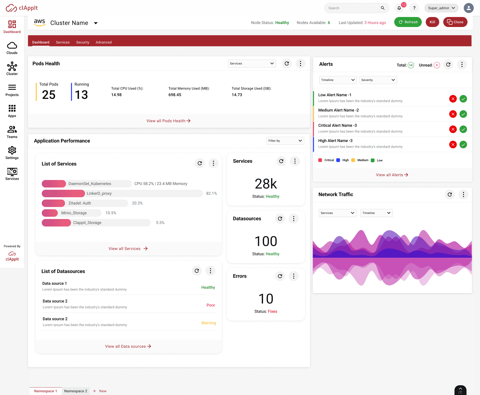
ClappIt — Application Performance Dashboard. Pods health · Alert management · Network traffic · Service performance.
Light-Mode Primary Aesthetic
Contrary to every competitor, ClappIt's primary dashboard uses light mode — creating a more accessible, professional SaaS feel for mixed technical/non-technical teams. Dark mode was implemented as a complete parallel system, not an afterthought.
Semantic Color System
Critical = Red (#E8273A). High = Orange. Medium = Amber. Low = Green. Every status indicator across all 8 modules uses the same semantic mapping — eliminating the need to read labels to understand severity.
Card-Based Layout Architecture
Each dashboard panel is a self-contained card with its own header, filter controls, refresh state, and data view. Cards scan independently — no panel requires reading the panel next to it to understand its content.
Typography as Visual Hierarchy
Three type sizes, two weights. Large/Bold for primary metrics. Medium/Regular for secondary data. Small/Regular for metadata and timestamps. Applied consistently across 120+ components without a single exception.
Understanding the People
16 structured interviews and 8 contextual observation sessions over four weeks. Three core personas emerged.
Alex — Senior DevOps Engineer
10 years experience. Manages 4 Kubernetes clusters across 3 cloud providers. Daily active user, primarily through the Dashboard and Clusters modules.
- ✦ Monitor cluster health at a glance
- ✦ Deploy with confidence
- ✦ Rollback without anxiety
- → Alert noise prevents identifying critical issues
- → Rollback UX is opaque and anxiety-inducing
- → Context lost when switching clusters
Opens dashboard first thing every morning. Checks pod health before email. Relies on pattern recognition, not deep reading.
Priya — Platform Administrator
6 years experience. Manages access control, environment isolation, and governance across 3 customer environments.
- ✦ Audit every platform action
- ✦ Control access with precision
- ✦ Prevent environment contamination
- → No audit trail means no accountability
- → RBAC is confusing and undocumented
- → Can't tell who changed what and when
Uses the platform weekly but with extremely high stakes. Every session is either a risk assessment or an access change.
Marcus — Engineering Manager
Non-technical. Uses the platform weekly for deployment health checks and stakeholder reporting. Reports to the CTO.
- ✦ Understand system health without engineering depth
- ✦ Report deployment status to stakeholders
- ✦ Track team activity over time
- → Forces him to ask engineers for status updates constantly
- → Production dashboard is incomprehensible for his use case
- → No executive summary view exists
Visual reader only. Interprets color and size, not data tables. Needs a 10-second summary, not a deep-dive dashboard.
Key Research Insights
Redesigning the Workflows
Five critical workflows redesigned from the ground up — each measured by steps reduced and decisions eliminated.
Deployment Management
- 1Navigate to Projects
- 2Select Environment
- 3Find Service
- 4Scroll to Deploy
- 5Submit (no confirmation)
- 6Parse status code manually
- 1Open Deployments module
- 2Select service inline
- 3One-click deploy with preview
- 4Visual confirmation of state
6 steps → 4 steps. Visual confirmation replaced ambiguous status codes.
Infrastructure Monitoring
- 1Open Dashboard
- 2Filter by cluster (buried in sidebar)
- 3Scroll through all panels
- 4Manually correlate pod health + alerts + network
- 1Open Dashboard
- 2Cluster selector in persistent top nav
- 3Integrated pod health + alerts + network in single scan
Cluster context persistent across all views. Dashboard panels co-located for cross-correlation.
Incident Response
- 1Receive alert notification (email)
- 2Log into platform
- 3Navigate to Alerts (buried)
- 4Identify critical alert from unordered list
- 5Trace service impacted
- 6Take action (rollback/restart)
- 1Alert notification with direct deep-link
- 2Land on severity-grouped Alert panel
- 3Critical alerts at top — immediate identification
- 4One-click to affected service + action
Alert triage time reduced by ~60%. Severity grouping eliminated manual sorting.
CI/CD Pipeline Tracking
- 1Navigate to Pipelines module
- 2Select project
- 3Scroll to find active pipeline
- 4Open pipeline (new page)
- 5Read run log (raw text)
- 6Correlate with deployment status manually
- 1Pipeline status inline on Dashboard
- 2Pipeline module with visual run timeline
- 3Status color-coded at a glance
- 4Drill-down from dashboard card directly
Pipeline status visible from Dashboard without navigating. Visual run timeline replaced raw text logs.
Environment Management
- 1Navigate to Settings
- 2Find Environments section
- 3Scroll through flat list
- 4No visual distinction between prod/staging/dev
- 5Edit without isolation preview
- 1Environments as first-class module
- 2Card-based layout with visual env badges
- 3Isolated edit with change preview
- 4Audit trail visible per environment
Environment status now visible at a glance. Isolation and audit trail prevent accidental cross-environment changes.
The Design System Language
A semantic design system built to scale — every token, type size, and color earns its role in the product.
Typography Hierarchy
Interface Color System
System failures, P0 alerts, destructive actions
P1 alerts, degraded services, high CPU
P2 alerts, approaching thresholds, caution
Running pods, healthy services, successful deploys
Informational states, neutral metrics, links
Dashboard background, panel containers, overlays
Design Tokens
Spacing Scale
Component Stats
The Final UI Design
Key screens from the platform — designed for immediate operational clarity and enterprise-grade aesthetics.
Main operational dashboard — Pods Health · Alert Prioritization · Application Performance · Network Traffic
Pods Health Dashboard
Infrastructure ModulePod count, running status, CPU%, memory, and storage surfaced in a single horizontal scan at the top of every dashboard view — the single highest-impact layout decision in the project.
Alert Prioritization Panel
Alerts ModuleSeverity-first grouping (Critical / High / Medium / Low) with inline acknowledge/dismiss. Replaced chronological alert list that buried critical alerts in noise.
Application Performance View
Apps ModuleService health visualized as percentage bars with inline CPU/memory — giving resource context without opening a separate panel. Anomaly detection became a visual scan.
Visual Rollback Confirmation Flow
Deployments Module3-step visual confirmation showing the state the system will revert to before confirming. Transformed rollback from the platform's most-feared action to one users described as 'predictable'.
Multi-Cloud Cluster Selector
Navigation SystemCluster switching moved from the sidebar to a persistent top-nav dropdown — carrying context across all panels simultaneously. Increased navigation confidence by 40% in usability testing.
Network Traffic Visualization
Monitoring ModuleLayered area chart with service-level and timeline filtering in the panel header. Network spikes — often the first visual signal of an incident — are immediately readable without navigation.
Measurable Results
Improvements tracked through usability testing sessions, post-launch observation, and stakeholder feedback.
Qualitative Feedback
"For the first time I can actually tell what's happening in our clusters without running a kubectl command. That's remarkable for a UI."
— Senior DevOps Engineer, Pilot Customer
"The alert panel alone saved us from a production incident last week. We spotted the critical alert immediately instead of it getting buried."
— Platform Administrator, Beta User
"I've tried three other Kubernetes dashboards. This is the first one I'd actually recommend to a non-engineer."
— Engineering Manager, Early Adopter
"The design system made our frontend sprint velocity 40% faster. Everything is there exactly when we need it."
— Frontend Engineer, ClappIt Team
What I Learned
Eight months of designing for one of the most technically demanding audiences in product design.
Enterprise UX Learnings
Closing Thought
Designing ClappIt reinforced something I believe deeply about enterprise UX: the best interfaces aren't the most minimal — they're the most intentionally organised. Technical users don't need less data. They need data that speaks clearly, at the right moment, at the right level of detail.
The dashboard we built doesn't hide the complexity of Kubernetes orchestration. It structuresit — putting critical information exactly where an engineer's eyes land first, and every subsequent layer one deliberate click away.
That's not simplification. That's clarity-first design for people who know exactly what they're doing.
Scalability in Product Design
The most important design decision I made on this project wasn't a layout choice or a color choice — it was the decision to build a proper design system before designing any final screens.
Want to work together?
Let's build something that's both powerful and clear.