Hindustan Shipyard
Unified Public Sector Portal
“The system already knew every status — but only a person could release it.”
Five disconnected modules wearing one logo. Applicants applied into silence, vendors waited on email, and HSL's own teams spent their days answering "where does mine stand?" by phone. I ran the stakeholder research across every branch and redesigned the ecosystem around a single rule: wherever someone was sending an email to find out where they stood, give them a screen that just tells them.
The Overview
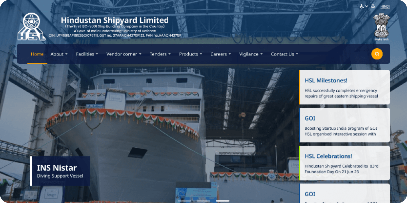
Hindustan Shipyard Limited builds and repairs ships for the Indian Navy and commercial fleets. Its digital presence was five disconnected systems wearing one logo — recruitment, tenders, vendor management, vigilance and the public portfolio. Whichever one you landed in, it ended the same way: send an email, then wait.
I worked on this at Sweya Infotech as UX researcher, designer and stakeholder point of contact — the person who sat with each module's owners, worked out what their branch needed, and carried it back into design. It went live.
What was in scope
Recruitment / HRMS
Candidate applications, status visibility, payroll and attendance for internal staff.
Tenders
Live tender listings, requirements, and updates — moved out of email and onto the platform.
Vendor Management
Procurement and partnership touchpoints for suppliers working with the shipyard.
Vigilance
Case raising and follow-up, with compliance-mandated content kept intact.
Company Portfolio
Capability, projects, and contact routes for clients, partners, and the public.
Accessibility
Treated as a cross-cutting baseline across every module rather than a finishing pass.
The Operational Reality
The platform was outdated and non-responsive, but that was the symptom. The problem was that none of the five modules could answer a question on its own. A candidate had no way to know whether anyone had opened their application. A vendor waited on email rather than checking a status. Internally that turned HR and the tender cell into a human status API, answering by phone what a screen could have answered instantly. The objective: let each audience self-serve the answer they were chasing, on any device, to a standard accessible enough for a public-sector organisation serving the general public.
Where people got stuck
- Candidates applied, then had no signal of any kind until an email arrived — if one arrived.
- Vendors depended on email confirmations and updates to know where a tender stood.
- Employees crossed between modules that each used different navigation and terminology.
What it cost HSL
- ✗ HR and the tender cell became a human status API, answering the same question by phone all day.
- ✗ Information the platform already held was re-sent manually, one message at a time.
- ✗ A missed email was a dead end — there was no second place to check.
One Rule, Applied Everywhere
Wherever someone was sending an email to find out where they stood, give them a screen that just tells them.
The brief arrived as a website redesign. The stakeholder sessions turned it into an ecosystem problem, and the redesign was organised around one rule — wherever someone was emailing to find out where they stood, give them a screen that tells them. That meant a candidate login showing the submitted resume and whether the application is selected, rejected or in process; a tenders dashboard putting live tenders, requirements and updates on the site instead of in a mailbox; and one navigation model, component set and accessibility standard across all five modules, so HSL reads as one organisation.
A candidate portal
Applicants log in to see their submitted resume on record and an explicit status — selected, rejected, or in process — instead of waiting on an email that may never arrive.
A live tenders dashboard
Live tenders, requirements, and updates published on the platform, making the site the authoritative source rather than a mail thread.
One system, five modules
A shared navigation model, component set, and accessibility baseline across HRMS, tenders, vendor management, vigilance, and the public portfolio.
What I Actually Owned
Sole UX researcher and designer, and the stakeholder point of contact across all five modules — research, information architecture, wireframes, high-fidelity screens and the shared component set.
- Stakeholder Research
- Requirement Discovery
- Information Architecture
- User Flows & Wireframes
- Accessibility
- UI & Design System
Who It's For, and How I Worked
Who I designed for
- Job applicants — applying and waiting on an outcome (Recruitment)
- Vendors and bidders — tracking live tenders and requirements (Tenders)
- HSL employees — payroll, attendance, internal comms (HRMS)
- Vigilance staff and complainants — raising and following up cases (Vigilance)
- Clients, partners and the public — capability, projects, contact (Portfolio)
The approach
I worked module by module rather than page by page, walking each branch through its current process step by step. From there I mapped a shared information architecture, wireframed the flows that removed the email round-trip, and built high-fidelity screens on a common component set so five modules could ship as one system. Requirements frequently conflicted between branches, so much of the role was reconciling them into one model before anything reached engineering.
Twelve Weeks
Eight weeks of research and UX before any visual design started — which is why the reframe from 'website redesign' to 'status visibility' happened early enough to matter.
UX Design
Weeks 1–8- 1Strategy and research planning across the five modules
- 2Stakeholder sessions, empathy mapping, and user journey mapping
- 3Problem statement and goal statement, reframed around status visibility
- 4Competitive analysis and a shared information architecture
UI Design
Weeks 9–12- 1Paper wireframes for the candidate and tender flows
- 2Visual design and prototyping on a common component set
- 3Usability checks and stakeholder review before handoff
Understanding the Workflows
Qualitative research
Research here was stakeholder-led rather than survey-led: the people who understood each workflow were the branch teams operating it. Each session was a walkthrough of the current process in their own words — what arrives, who handles it, where it waits, and which questions they end up answering by phone. Reconstructing those workflows out loud is what exposed the failure shared across every module: the system held the status, but only a person could release it.
Research approach
Stakeholder-led rather than survey-led. Working sessions with the branch teams who operated each module day to day, walking their real process step by step instead of asking them to describe it in the abstract.
What I asked in each session
Recruitment & HRMS teams
- Walk me through what happens from application submitted to candidate informed.
- What do candidates call to ask, and how often?
- Where does an application sit longest, and who is waiting on whom?
- What would a candidate need on screen for that call not to happen?
Tenders & vendor teams
- How does a vendor find out a tender is live, and that something changed?
- What do you re-send by email that already exists somewhere?
- How does a vendor confirm you received their submission?
- Which questions could a page answer instead of you?
Vigilance & portfolio owners
- What has to stay exactly as it is for compliance?
- Who reads this module, and what are they trying to find?
- Where does your terminology differ from the other branches?
Key insights
Applying was a black box.
A candidate submitted, then got no signal of any kind — no acknowledgement, no stage, no outcome — until an email arrived, if one arrived. The anxiety came from an invisible process, not a slow one. This became the clearest design mandate in the project.
Tender information lived in inboxes rather than on the platform, which made the authoritative record a message thread: impossible to search, easy to miss, inconsistent between recipients..
Staff were being used as a status lookup.
Teams described spending a significant part of the day on "where does mine stand?" calls — a design problem showing up as a staffing cost.
Five modules meant five mental models.
Each had grown separately, with its own navigation logic and terminology, so users crossing between them had to relearn the site.
Accessibility could not be a finishing pass.
A public-sector body serving applicants, vendors and the general public across a wide range of devices and connections has to start there.
Empathy Map
Synthesised from the stakeholder sessions — what applicants and vendors were actually doing, and why the silence was the part that hurt.
Says
- Has anyone actually looked at my application?
- Can I see the tender documents without waiting for the mail?
- I just need to know which department handles this.
Thinks
- Is this information current, or is it last year's?
- Did my submission even go through?
- Will I be told if something changes, or do I have to keep checking?
Does
- Applies for a job opening, then waits with no confirmation.
- Calls or emails the office to ask for a status update.
- Re-checks the tenders page repeatedly for changes.
- Logs in to the employee portal for payroll or attendance.
Feels
- Anxious after applying, because silence is indistinguishable from rejection.
- Frustrated at having to phone a person to retrieve a fact.
- Reassured when a status is visible without asking anyone.
- Confident in the organisation when the platform looks and behaves current.
The working drawings
Stakeholder sessions across five modules, synthesised into the structure the screens were built on.
Applying is a black box
- Submits an application, then waits with no confirmation
- “Has anyone actually looked at my application?”
- “Did my submission even go through?”
Status lives in an inbox
- Vendors depend on email to learn a tender changed
- “Can I see the tender documents without waiting for the mail?”
- Re-checks the tenders page repeatedly for changes
Staff are the status API
- Calls or emails the office to ask for an update
- Teams spend a large part of the day answering “where does mine stand?”
- “I just need to know which department handles this.”
- 01Submitted
- 02Under review
- 03Shortlisted
- 04Decision
Who I Designed For
The three groups the stakeholder sessions kept pointing back to — described from what module owners reported, not from invented personas.
Job Applicants
Engineers and staff applying to HSL. They submit into a process with no visible stages, and cannot tell "still under review" from "never opened" from "rejected". Every follow-up means contacting HSL directly.
Frustrations
- No acknowledgement or reference after submitting.
- No visibility into whether the application was reviewed.
- Outcomes by email only, with no fallback if it is missed.
Goals
- Apply without ambiguity about what was submitted.
- Know the current stage at any time.
- Understand what happens next.
What I designed
- A candidate login with the submitted resume on record.
- Explicit status — selected, rejected or in process — on the candidate's own dashboard.
- Status in the product, not only in an email, so a missed message is not a dead end.
Vendors & Bidders
Suppliers and contractors bidding for HSL work. Confirmations, documents and updates all arrived in an email thread, which made the mailbox the system of record and put the burden of chasing changes on the vendor.
Frustrations
- Tender updates by email, with no authoritative page to check.
- No way to confirm a submission without calling the tender cell.
- Re-checking the site for changes never announced there.
Goals
- See all live tenders and requirements in one place.
- Confirm submission and standing without a phone call.
- Trust that what is on screen is current.
What I designed
- A tenders dashboard holding live tenders, requirements and updates on the platform.
- Details on screen rather than distributed by email, making the site the source of truth.
- One consistent structure, so vendors stop relearning each listing.
HSL Internal Teams
The branch teams operating each module. Because status was invisible outside the building, they absorbed the gap personally — fielding the calls and re-sending information the system already held.
Frustrations
- A recurring share of the day spent answering status questions.
- Manually re-sending information the system already held.
- Each branch running its own terminology and process.
Goals
- Stop being the lookup mechanism for what the platform already has.
- Publish once and have it stay current for every audience.
- Keep compliance-mandated content intact while modernising around it.
What I designed
- Shared navigation and components, so five branches ship as one system.
- Status surfaced to the audience that needs it, removing the round-trip.
- One vocabulary across modules, agreed with the branches first.
Design Thinking Process
Five modules, five sets of stakeholders, and a brief that changed shape once research started — the process below is how that stayed manageable. The value wasn't the framework itself; it was that Empathize and Define ran long enough to reveal that this was a status-visibility problem rather than a visual one. Everything after that point was comparatively cheap, because the team was solving the right thing.
- 1
Empathize
- Stakeholder Sessions
- Workflow Walkthroughs
- Competitive Analysis
- 2
Define
- User Groups
- Journey Mapping
- Goal Statement
- Empathy Map
- 3
Ideate
- Brainstorming
- Card Sorting
- User Flows
- 4
Design
- Paper Wireframes
- Visual Design
- Prototype
- 5
Test
- Usability Checks
- Stakeholder Review
- Improvements
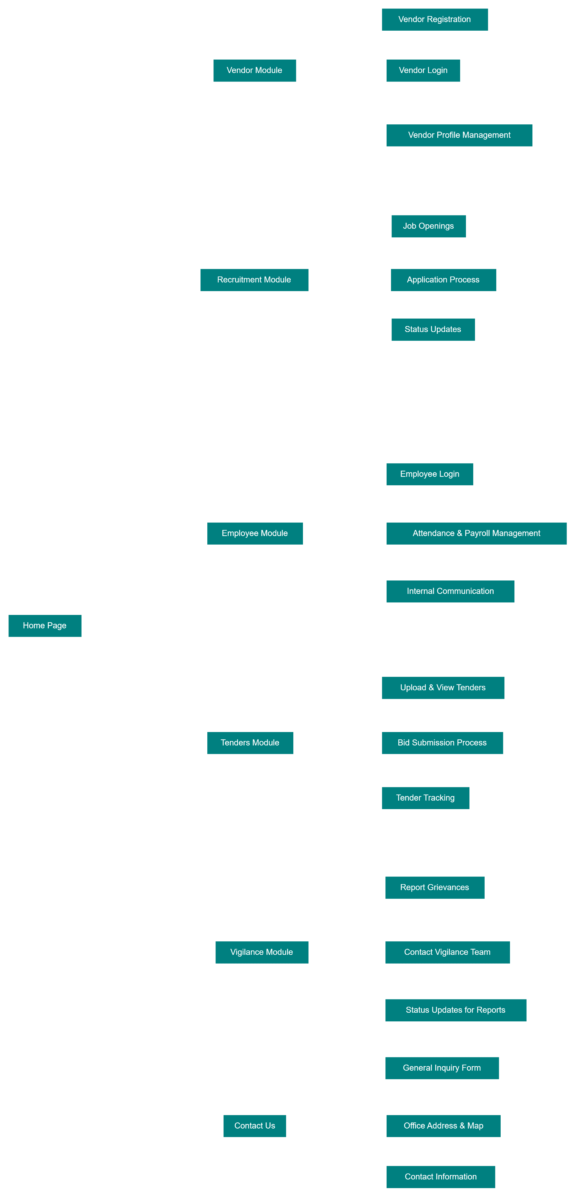
Information Architecture
One structure spanning all five modules, so a user crossing from tenders into recruitment doesn't have to relearn the site.
Visual Design
A current, credible look for a shipyard whose platform had stopped reflecting its actual capability — carried across desktop and mobile from the same component set.

Typography & Colour
Typeface
Noto Sans
ABCDEFGHIJKLMNOPQRSTUVWXYZ
abcdefghijklmnopqrstuvwxyz
1234567890
A neutral, highly legible sans-serif chosen for reach rather than personality. HSL's platform has to work for applicants, vendors, and the general public across a wide range of devices and screen sizes, so the priority was clarity at small sizes and a full weight range to carry hierarchy through dense content like tender listings and HR records — without the typeface itself competing for attention.
Weights in use
Colour
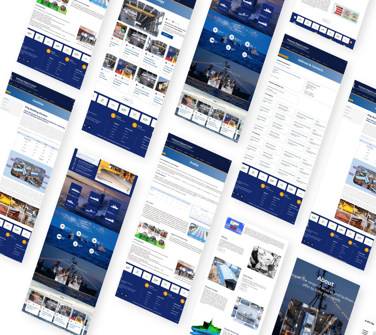
The Final Screens
The flows that removed the email round-trip — candidate status, tender listings, and the module surfaces around them.
What Actually Shipped
The redesigned ecosystem went live. The clearest signal of impact came from the teams who had been absorbing the problem: with candidate status and tender information now published in the product, HR and the tender cell reported a noticeable drop in inbound status calls — the work that had been done by phone was now being done by the interface.
Shipped to production
The redesign went live across the modules in scope, rather than ending as a prototype or a pitch deck.
Fewer status calls to HR and tenders
Both teams reported reduced inbound calls and emails once applicants and vendors could check their own status. The support burden moved from people to the product.
Applying is no longer a black box
Candidates can log in and see their submitted resume and whether they are selected, rejected, or in process — replacing an indefinite wait for an email.
Tender information left the inbox
Live tenders, requirements, and updates moved onto the platform, making the site the authoritative source instead of a mail thread.
Five modules, one system
A shared IA, component set, and accessibility baseline across recruitment, tenders, vendor management, vigilance, and the public portfolio.
What I took from it
The brief was a website redesign; the problem was status visibility. Had I designed to the brief as written, HSL would have received a better-looking version of the same bottleneck. The stakeholder walkthroughs — asking what people get asked on the phone — are what reframed it, and that question is now the first one I ask on any operational product.
Being the stakeholder point of contact was the harder half of the job. Five branches had five sets of requirements that regularly contradicted each other, and most of the design work was reconciling them into one model before a single screen reached engineering.
What I would do differently: I did not instrument the launch. I have the qualitative signal from HR and the tender cell, but not the numbers behind it — call volume before and after, application-status page usage, drop-off in the tender flow. On later work I define those measures during design rather than hoping to reconstruct them afterwards.
Course correction
What I got wrong
- First take
- I took the brief at face value: the platform was outdated and non-responsive, so this was a visual and responsive redesign across five modules.
- What changed it
- The stakeholder sessions kept returning to the same thing, and it was never layout. Staff were spending a large part of the day answering “where does mine stand?” — the system already held every status, but only a person could release it.
- What I did
- Reframed the project from a redesign to a status-visibility problem, and reran Define against that. The candidate portal and the tenders dashboard exist because of that reframe; a purely visual refresh would have shipped and changed nothing.
Want to work together?
Let's make the status visible before it becomes a phone call.